Finding Your Foundation Shade by Undertone, Depth and Daylight
Foundation that turns orange, gray or mask-like by midday usually comes from testing on the wrong spot, under shop lights, without checking undertone. Here is a repeatable test for the counter or for online samples.
Drafted with AI. This version has not been reviewed by an editor, so it carries no ads — how we work.
A foundation that looks right at the counter and orange, gray or mask-like by lunch is almost always the result of three mistakes made together: testing on the wrong part of your body, judging it under shop lighting, and choosing for depth while ignoring undertone. Fix those and you can pick a shade that disappears into your skin, whether you are standing at a makeup counter or opening a pack of mail-order samples at home. This guide gives you a test you can repeat every time you buy, plus the questions to ask and the clues to read on a label.
Depth and undertone are two separate questions
Every foundation shade answers two questions, and you need the right answer to both. Depth is how light or dark your skin is: fair, light, medium, tan, deep and so on. Undertone is the hue that sits beneath the surface color: warm (golden, yellow or peachy), cool (pink, red or bluish), neutral (a balance of both) or olive (a muted greenish or gray-gold cast).
The two vary independently. Two people can share exactly the same depth while one leans golden and the other pink, and a shade that suits one will look wrong on the other. Most people find depth easily because it is obvious in the mirror. Undertone is the part that gets skipped, and it is behind most of the orange and gray complaints.
Your surface tone changes with sun exposure, redness, blemishes and dryness. Your undertone stays put. That is why a foundation can match your depth perfectly in winter and still look off: the depth was right, but the hue was not.
Working out your undertone: warm, cool, neutral or olive
No single at-home test is decisive, so use several and look for agreement. Do them in daylight with a clean, bare face.
- Vein color. Look at the inside of your wrist. Veins that look mostly green suggest warm; mostly blue or purple suggests cool; a mix suggests neutral. The limit: veins look bluish through skin for almost everyone, and on deeper skin they can be hard to see at all, so treat this as a weak clue.
- Jewelry. Hold gold and silver against your skin. If gold makes your skin look brighter and silver makes it look dull, you likely lean warm; the reverse suggests cool; if both look fine, neutral. The limit: preference is shaped by your hair, eye color and taste, so it is easy to fool yourself.
- White fabric. Hold a stark white towel or T-shirt under your chin, then an off-white or cream one. If pure white makes you look sallow or washed out and cream looks kinder, you probably lean warm. If cream makes you look yellow and pure white looks crisp, you probably lean cool. The limit: a recent tan or facial redness can skew the result.
- How you react to sun. Skin that tans easily and rarely burns often leans warm or olive; skin that burns pink before it tans often leans cool. This is a loose pattern, not a rule.
Spotting an olive undertone
Olive is the undertone the simple tests miss most often, because it reads as both warm and cool. Signs include skin that looks slightly green or gray-gold in daylight, gold and silver both looking a little off, and a long history of foundations that turn orange when they are labeled warm and pink or ashy when they are labeled cool. If that describes you, look for shades described as olive, or try neutral shades with a yellow rather than pink lean, and run them through the jawline test below.
Once you know your undertone, it helps with color choices beyond foundation too, such as whether a cool brown lip will flatter you or fight your skin.
Where to swatch: jawline, not wrist
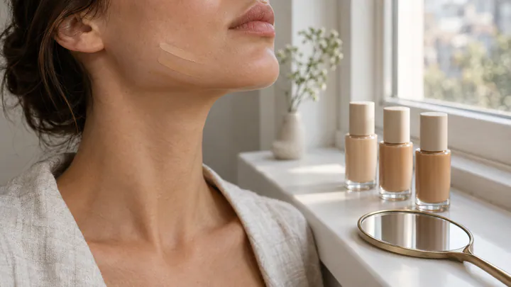
Your wrist and the back of your hand are usually a different color from your face, often lighter or more tanned, and the skin texture is different. Matching there produces exactly the mask effect you are trying to avoid. Swatch along the jaw, where your face meets your neck, because the goal is for your face to blend into your neck without a visible line.
- Start bare. Remove any foundation or tinted product from the lower half of your face. Moisturizer is fine; heavy primer can change how the formula sits.
- Pick three close shades. Choose the shade you think is right, one a step lighter and one a step darker, all in the undertone family you identified. If you are unsure of undertone, choose three at the same depth with different undertones instead.
- Paint stripes. Apply each shade in a thin vertical stripe, about 1 inch long, running from your cheek down over the jawline onto the neck. Leave a little bare skin between stripes.
- Blend lightly. Tap or smooth the edges so each stripe is a thin, even layer, closer to how you would wear it than a thick blob.
- Look for the one that disappears. The winning shade is not the one that looks nice; it is the one you struggle to see. A stripe that looks like a stripe is wrong, whether it reads lighter, darker, pinker or more orange.
If your face is noticeably redder or darker than your neck, match the jaw and neck rather than your cheeks, and handle redness with a separate color corrector or concealer. If you often wear open necklines, glance at your chest as well; a shade that suits face and neck but stops abruptly at the collarbone can still look like a mask.
Checking in daylight and waiting for oxidation
Shop lighting is designed to make products look appealing, not to show you how they will look in an office or outdoors. Many stores use bright, cool lights or warm spotlights, and both shift how a swatch reads. Before you decide, walk to a window or step outside with a hand mirror. Indirect daylight, such as near a window that is not in direct sun, gives the most honest view; harsh midday sun can wash everything out.
Then wait. Some foundation formulas darken or turn warmer as they dry and interact with air and your skin's oils, a change usually called oxidation. A shade that disappears the moment you apply it can look a half-shade darker or more orange later. Give the stripes at least 15 to 30 minutes, ideally while you go about your shopping, then check them in daylight again. If one stripe has drifted, rule it out or move one shade lighter in the same undertone.
If you have oily skin, oxidation and shine can be more noticeable over a full day, so a sample worn from morning to evening tells you far more than a counter swatch.
What a midday mismatch is telling you
If your current foundation already lets you down, the way it fails points to the fix.
| What you see | Likely cause | What to try next |
|---|---|---|
| Orange or brassy | Too warm, too dark, or a formula that oxidizes on you | Go one step lighter or more neutral; if you are olive, look for olive shades |
| Gray or ashy | Too light, or too cool or pink for your undertone (common on deeper and olive skin) | Go one step deeper or warmer; check the swatch in daylight |
| Pink or flushed-looking | Too cool for a warm or olive undertone | Try neutral or warm shades at the same depth |
| Mask-like, visible line at the jaw | Matched to cheeks or wrist instead of jaw and neck; or depth is off | Rematch using jawline stripes and blend down onto the neck |
| Fine in the morning, wrong by noon | Oxidation, or oil changing the color over the day | Wear a sample for a full day before buying |
Questions to ask at the counter
A few direct questions save you from buying a full bottle on a guess:
- Can I swatch three shades on my jaw? If the staff member wants to test on your hand, ask for the jaw instead.
- Can I take a sample home? Many counters will decant a small amount so you can wear it for a full day and check it in your own lighting.
- What undertone is this shade meant to be? Shade names are often vague; staff usually know the brand's system.
- Is there a lighter or deeper shade in the same undertone? This keeps you within one undertone family while you fine-tune depth.
- Does this formula tend to darken as it sets? Staff may not know for certain, but if they mention it, factor it in.
- What is the return policy on opened foundation? Policies vary by store, and knowing it lowers the cost of a near-miss.
Buying online: decoding shade names and numbers
Online, you lose the jawline test unless you order samples, so read the label carefully. Many brands use a letter to signal undertone:
- W for warm
- C for cool
- N for neutral
- Some brands add O for olive, Y or G for yellow or golden, and P or R for pink or rose
The number usually indicates depth within that brand's range, often rising as shades get deeper. The catch is that there is no shared standard across brands. A 220 at one brand can be lighter, darker or a different undertone from a 220 at another, and one brand's "medium" can be another's "light." Treat numbers as meaningful only inside a single brand's lineup.
To narrow your choice:
- Start from a shade you know. If a foundation already matches you, many brands and retailers offer shade-comparison tools that translate it into their range. Use these as a starting point, not a final answer.
- Read the shade description over the name. "Light with neutral-golden undertones" tells you more than a name like "Sand" or "Biscuit."
- Be wary of swatch photos. Screens, cameras and lighting all shift color, so a photo can be off by a full shade or more.
- Order samples of three adjacent shades where you can. Sample sizes often cost a few dollars, far less than a wrong full-size bottle, and they let you run the jawline stripe test at home by a window.
Budget matters here as well: if you are working with drugstore formulas, the same matching method applies, and a lower price makes it easier to buy two adjacent shades if a sample is not available. Our guide to affordable makeup under $25 covers products at that price point.
When you're between shades: mixing and seasonal changes
If one stripe is slightly too light and the next slightly too dark, you are between shades, and that is common. Mixing two shades of the same formula gives you a custom match. Stick to one formula and one undertone family: mixing a matte and a dewy foundation, or a water-based and a silicone-heavy one, can separate or apply unevenly.
Mixing also solves seasonal changes. Many people get lighter in winter and deeper in summer while their undertone stays the same. Rather than buying a new shade every few months, buy the lightest and deepest shades you wear across the year and adjust the ratio.
Worked example: adjusting a two-shade mix through the year
Say you use about 4 drops of foundation per application and own one lighter and one deeper shade in the same undertone. An illustrative schedule might look like this:
- Winter: 3 drops light + 1 drop deep (75% light)
- Spring and fall: 2 drops light + 2 drops deep (an even mix)
- Summer: 1 drop light + 3 drops deep (75% deep)
Mix on the back of your hand or a clean palette, then check the blend on your jaw in daylight before applying it all over, because your own color shift may not follow the calendar neatly. The trade-off is up-front cost: two bottles cost more than one, though each lasts roughly twice as long since you use half as much of it on average.
If you would rather not mix, a lighter shade can be warmed up with bronzer through the summer months, but that only works when the base shade already matches your undertone. No amount of bronzer fixes a foundation that is pink on golden skin or golden on pink skin, which is why the undertone question comes first every time you buy.