Modern Calligraphy for Beginners: Tutorials That Work
Modern calligraphy is learnable in evenings, not years — if you start with the right pen, drill seven strokes before you touch the alphabet, and avoid the paper choice that shreds brush tips. Here is the beginner path to follow.
Rewritten with AI and republished automatically. Our editors set the standards and fix reported errors — how we work.
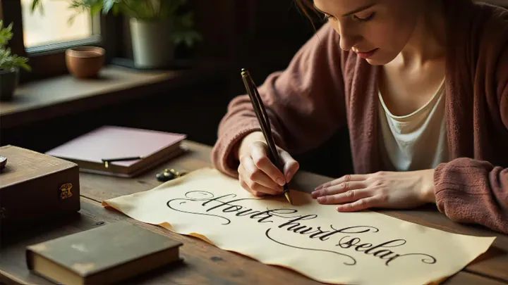
TL;DR: Buy one hard-tip brush pen and a pad of smooth paper. Drill seven basic strokes for two weeks before attempting letters, then learn lowercase in groups that share a shape. Practice 15 minutes a day, use reusable guide sheets, and keep textured paper away from your pens.
What is modern calligraphy, and how is it different from traditional calligraphy?
Modern calligraphy is a style of decorative lettering in which thin upstrokes and thick downstrokes are produced by varying pen pressure, without the fixed slant, spacing, and letterform rules of historical scripts. Traditional scripts such as Copperplate and Spencerian are governed by strict angle and proportion systems taught with a pointed dip nib. Modern calligraphy borrows the thick-thin logic and discards the rulebook.
That freedom is why it dominates wedding stationery, bullet journals, art prints, and social posts — and also why it confuses beginners. There is no single correct alphabet to copy, so progress comes from mastering strokes rather than memorizing a font.
One honest caveat: if your goal is formal, historically accurate Copperplate for a wedding suite, this path is not the shortest one. You will want a pointed nib (a Nikko G or Zebra G), an oblique holder, and a structured exemplar-based course. Modern brush lettering will still help, but it is a different discipline.
What supplies do beginners actually need, and what do they cost?
A workable starter kit is one brush pen, one pad of smooth paper, a pencil, and a ruler — typically under $20 total. Everything else is optional for months. The two decisions that actually affect your results are tip firmness and paper smoothness.
Tip firmness should match your hand pressure. If you press hard enough to dent the page when you write normally, start with a hard tip; soft, flexible tips splay and fray under heavy pressure and produce wobbling downstrokes. If you have a light touch, a soft tip gives you dramatic contrast sooner.
| Tool | Tip type | Best for | Typical cost | Watch out for |
|---|---|---|---|---|
| Tombow Fudenosuke (hard) | Firm, small | First pen; heavy-handed writers | ~$4 | Contrast is subtle at first — that is normal |
| Tombow Fudenosuke (soft) | Flexible, small | Second pen; adding contrast | ~$4 | Splays if you press too hard |
| Pentel Sign Pen (brush tip) | Flexible, small-medium | Smooth, juicy lines for daily practice | ~$4 | Ink flows fast; bleeds on cheap paper |
| Tombow Dual Brush Pen | Large, flexible | Big headline lettering, color work | ~$3 each | Hard to control at small sizes |
| Crayola Super Tips | Large, very flexible | Cheap high-volume practice, kids' setups | ~$0.30 each | Tip shape varies; not for fine detail |
| iPad + Apple Pencil + Procreate | Pressure-sensitive digital | Layout, color, client mockups | Hardware cost + one-time app fee | Undo button hides bad pressure habits |
For paper, use a marker pad, a Rhodia or Clairefontaine pad, or heavyweight laser printer paper (32 lb or similar). Standard copy paper and most sketchbooks are toothy enough to act like fine sandpaper on a brush nib.
What are the basic strokes, and how long before they feel natural?
There are seven foundational strokes, and most people need about two weeks of short daily sessions before they stop thinking about them. Every lowercase letter in a modern calligraphy alphabet is a recombination of these shapes, which is why drilling them beats copying whole words early on.
- Upstroke: light pressure, thin line, traveling up at a consistent slant.
- Downstroke: firm pressure, thick line, released cleanly at the baseline.
- Underturn: thick down, curve, thin up (the backbone of i, u, t).
- Overturn: thin up, curve, thick down (n, m, h).
- Compound curve: overturn plus underturn in one motion.
- Oval: the shape hiding inside a, d, g, o, q.
- Ascending and descending loops: the tall and low flourishes of l, b, y, j.
The transition point is where beginners lose the line: pressure must change at the top and bottom of the curve, not halfway down. Slow down until the change happens exactly where you intend, then let speed come on its own.
A useful drill most tutorials skip
Fill one line with a stroke at your natural speed, then fill the next line at roughly half that speed. Compare them. If the slow line is dramatically better, your hand knows the shape and your speed is the problem — a fixable issue. If both look the same, you need more repetitions of the shape itself.
How should you build the alphabet without getting stuck?
Learn lowercase first, grouped by shared shape rather than alphabetically. The alphabet is not a random list; letters that begin with the same stroke should be practiced together so the muscle memory compounds.
- Underturn family: i, u, t, w
- Overturn family: n, m, h, r, v, x
- Oval family: a, c, d, g, o, q
- Loop family: b, e, f, j, k, l, p, s, y, z
Only after lowercase reads cleanly should you tackle uppercase, which is far less systematic — capitals are where personal style lives and where beginners waste weeks if they start there. Then move to connecting letters into short words, which introduces the real skill: consistent spacing.
Video tutorials earn their place here. A still worksheet shows you the destination; a video shows you the hand motion, the pauses, and the pen angle. Watch one at half speed, then mirror it on your own page rather than watching ten in a row.
How much practice do you actually need each week?
Fifteen focused minutes a day beats two hours on Sunday, because pressure control is motor learning and motor learning rewards frequency. A simple rotation keeps sessions from turning into aimless doodling:
- Monday: basic strokes only
- Tuesday: one lowercase letter family
- Wednesday: a second family, plus Tuesday's as a warm-up
- Thursday: connect three- to five-letter words
- Friday: uppercase experiments
- Weekend: one finished piece — a card, a quote, a label
Anchoring the session to something you already do daily makes it stick. A small anchored ritual like the 10-minute morning sunlight habit survives because it attaches to an existing routine; lettering behaves the same way when it lives next to your coffee rather than in a "someday" drawer.
What beginner mistakes cost the most time and money?
Three mistakes account for most abandoned practice pads, and all three are avoidable in the first week.
Using the wrong paper. This is the expensive one. Textured paper frays a brush tip within a few sessions, after which the pen produces furry edges no matter how good your technique is. Beginners blame themselves, buy another pen, and repeat the cycle. Smooth paper can triple the life of a $4 pen.
Writing instead of drawing. Handwriting is one continuous motion; calligraphy is a sequence of separate strokes with lifts between them. If your letters look shaky, you are almost certainly moving too fast and refusing to lift the pen.
Chasing new alphabets before owning one. Collecting a dozen styles from a dozen creators leaves you with a dozen half-formed habits. Pick one exemplar you like and stay with it until you can reproduce it from memory.
Where do you get practice sheets without burning through paper?
Printable practice sheets — stroke tracing pages, full alphabets, and slant-grid paper — are freely available from most lettering educators' sites, and the smartest move is to make them reusable. Slide one sheet into a clear plastic sleeve or laminate it, then work on top with a dry-erase marker.
Two caveats worth knowing. First, a plastic surface changes the friction under a brush tip, so it is excellent for shape and rhythm drills but not for judging your true line quality. Second, use grid paper underneath plain sheets rather than printing grids onto every page — you keep the guidance and get a clean piece you can actually give away.
Should you learn on paper or go digital with Procreate?
Start on paper for the first month, then add digital if you enjoy design work. Pressure control learned with a physical brush pen transfers directly to an Apple Pencil; the reverse transfer is weaker, because the undo button lets you delete bad strokes instead of correcting the habit that produced them.
Where digital genuinely wins is everything after the letters: resizing a word, testing five color palettes, rearranging a composition, and exporting something printable. If you are curious about how much serious creative processing now happens on the tablet itself rather than in the cloud, our explainer on on-device AI and what it means for you covers why creative apps have gotten so responsive offline.
A practical hybrid workflow: letter on paper, photograph in even daylight, import, trace or clean up digitally. You keep the character of a real brush stroke and gain the flexibility of vectors.
How do you lay out a full quote instead of a single word?
Sketch the layout in pencil before inking, working from the emphasis outward. Decide which one or two words carry the meaning, give them the largest and most decorative treatment, then shrink and simplify the connecting words — "the," "of," "and" — into small caps or a plain serif.
- Draw a light bounding shape first: a rectangle, circle, or wave the text must fill.
- Vary size and style between lines so the block has rhythm rather than uniformity.
- Use the empty space inside long loops and descenders to nest short words.
- Check balance by turning the page upside down — imbalance is far easier to see when you cannot read it.
Finished pieces deserve to be seen. A single framed quote is one of the cheapest upgrades to a wall.
How do you develop a style that looks like yours?
Style emerges from deliberate variation, not from waiting for inspiration. Once your baseline alphabet is stable, change exactly one variable at a time and write the same word repeatedly: slant, letter width, stroke contrast, x-height, or the length of entry and exit strokes.
Studying other letterers helps, provided you analyze rather than admire. Ask what the artist's oval shape is, how far their descenders drop, whether their baseline bounces. Those are copyable decisions. "It looks nice" is not.
And keep faux calligraphy in your toolkit. Writing a word in ordinary cursive and thickening the downstrokes by hand works on chalkboards, gift tags, mugs, and any surface a brush pen refuses — and it keeps your understanding of stroke logic sharp.
Key takeaways
- One hard-tip brush pen and a pad of smooth paper is a complete beginner kit; paper choice matters more than pen price.
- Drill the seven basic strokes for two weeks before attempting letters, then learn lowercase in shape families rather than alphabetical order.
- Fifteen minutes daily outperforms long weekend sessions, because pressure control is motor learning.
- Shaky letters almost always mean you are writing too fast and not lifting the pen between strokes.
- Learn on paper first; move to Procreate for layout, color, and sharing once your strokes are stable.
- Style comes from changing one variable at a time — slant, width, contrast — not from copying ten alphabets at once.
Frequently asked questions
What is the best brush pen for a complete beginner?
The Tombow Fudenosuke with the hard tip is the safest first pen for most beginners: its firm nib survives heavy-handed pressure, keeps letters small enough to stay controlled, and still produces a clear thick-thin contrast. Move to a soft tip or a larger brush pen once your downstrokes are consistent.
How long does it take to learn modern calligraphy?
Most people write recognizably pleasing lowercase words after roughly four to six weeks of 15 minutes a day. Basic strokes feel automatic in about two weeks, the lowercase alphabet in a month, and confident word spacing and layout usually take a few months of applied projects.
Do I need good handwriting to learn calligraphy?
No. Calligraphy is drawing letter shapes stroke by stroke, not writing them in one continuous motion, so it uses different habits than handwriting. People with untidy cursive often progress quickly because they have fewer ingrained speed habits to unlearn.
Can left-handed people do modern calligraphy?
Yes, and no special pens are required. Most left-handed letterers rotate the paper 45 to 90 degrees clockwise so the pen pulls rather than pushes on downstrokes, and many find an underwriter position more comfortable. Quick-drying pigment ink helps avoid smudging along the hand.
What paper should I use for brush pen calligraphy?
Use smooth, coated paper such as a marker pad, Rhodia pad, or heavyweight laser printer paper. Textured sketchbook and copy paper acts like fine sandpaper and frays brush tips within a few practice sessions, which is the most common reason beginners think their pen has "died."
Is digital lettering on an iPad better than paper?
Neither is better — they teach different things. Paper builds pressure control and muscle memory that transfers to any tool, while Procreate on an iPad makes layout, resizing, and color experiments nearly free. Our advice is to spend the first month on paper, then use digital work for composition practice.
What is faux calligraphy and why should beginners learn it?
Faux calligraphy is writing a word in ordinary cursive with any pen, then manually thickening every downstroke and filling it in. It teaches you where thick strokes belong without requiring pressure control, and it lets you letter on surfaces like chalkboards, mugs, and craft paper where brush pens will not work.