
Watercolor Painting Tips That Make Your Work Look Pro
Most beginner watercolors fail for three fixable reasons: thin paper, too much water at the wrong moment, and painting over a layer that was not dry. Here is how to fix all three, plus the palette, paper and framing choices that make finished work look professional.
Rewritten with AI and republished automatically. Our editors set the standards and fix reported errors — how we work.
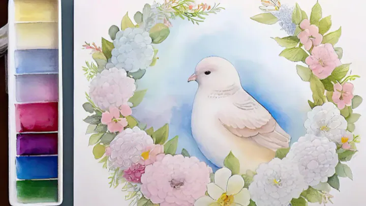
TL;DR: Pro-looking watercolor comes down to three things: paper that can take water, knowing exactly how wet the surface is before each stroke, and layering light to dark with full drying in between. Get those right and a six-color palette will outperform a 36-pan set.
Watercolor is a painting medium in which transparent pigment is suspended in water and gum arabic, so the white of the paper — not white paint — provides every highlight. That single fact explains most of the advice below. Once you accept that the paper is doing half the work, your choices about supplies, sequence and restraint all start to line up.
What actually separates a pro-looking watercolor from a beginner one?
Three things, and none of them is talent. Professionals use paper that can absorb repeated washes without buckling or pilling, they let each layer dry completely before adding the next, and they leave white paper untouched instead of painting around highlights later.
Beginner paintings usually go wrong in the same order: the paper cockles, the artist keeps fiddling with a half-dry wash, the colors gray out into mud, and white gouache gets called in to rescue highlights that were never planned. Fixing the first item removes most of the rest.
Which supplies are worth the money when you're starting out?
Spend on paper first, paint second, brushes last. A 100% cotton block and six artist-grade tubes will teach you more in a month than a drawer of cheap pans, because cheap paper actively punishes correct technique.
| Type | How it behaves | Best for | Relative cost |
|---|---|---|---|
| Wood-pulp (cellulose), 90 lb / 190 gsm | Buckles fast, absorbs unevenly, pills if you scrub | Swatching and drills only | Lowest |
| Cellulose, 140 lb / 300 gsm | Usable, dries quickly, limited lifting | Daily practice, sketchbook work | Low |
| 100% cotton cold-press, 140 lb | Stays wet longer, blends smoothly, tolerates lifting | The default choice for almost everything | Moderate to high |
| 100% cotton hot-press | Smooth, slick, paint moves unpredictably | Botanical detail, ink and wash, lettering | High |
| 100% cotton rough | Pronounced tooth, dramatic dry-brush texture | Skies, seascapes, loose landscapes | High |
For brushes, a size 8 or 10 round with a good point, a 1-inch flat wash brush and a small size 2 round cover nearly every job. Synthetic brushes have improved enormously and hold a point well; sable holds more water but costs several times as much and is not a beginner requirement.
One detail to check on paint tubes: the lightfastness rating, usually printed as ASTM I or II, or as a star system. Some inexpensive sets use fugitive dyes that fade within a year or two on a lit wall, which is a miserable discovery after you have framed something.
How do I control water without making a muddy puddle?
Use the shine test. Tilt the paper toward a window or lamp and look at the reflection: a glossy, uniformly shiny surface is genuinely wet and will blend anything you add; a matte-but-cool surface is the danger zone where a new stroke creates a bloom; a dry, room-temperature surface is safe for sharp edges.
That one habit replaces a dozen vague instructions about "the right amount of water." The corollary decision rule is equally simple: if the surface is in the danger zone, put the brush down and walk away. Make tea. Reorganize your pencils. The wash will be dry in a few minutes and fully repairable.
To build the underlying muscle memory, practice a flat wash and a graded wash on scrap paper — full pigment at the top, clear water at the bottom, no visible steps. Ten minutes a day for two weeks does more than any tutorial.
When should I use wet-on-wet versus wet-on-dry?
Wet-on-wet means loading pigment onto paper you have already dampened, producing soft, diffused edges — skies, distant hills, fog, shadow under a chin. Wet-on-dry means painting onto dry paper for crisp, controlled edges — window frames, tree trunks, the eye of a bird, anything in the foreground.
The practical rule: everything the viewer's eye should slide over goes wet-on-wet, and everything the eye should stop on goes wet-on-dry. A painting that is entirely soft looks unfinished; a painting that is entirely sharp looks stiff and flat. Contrast between the two is what reads as depth.
Worked example — a five-minute sky: brush clean water over the top third of the paper until it shines evenly, drop in a diluted ultramarine at the top and let it drift down, tip the board slightly so gravity does the blending, then stop touching it. Let it dry completely. Now, wet-on-dry, paint a dark treeline across the bottom of that sky with a small round brush. Two techniques, one convincing landscape, no white paint anywhere.
Which colors should be in a beginner's palette?
Six to eight, chosen as a warm and cool version of each primary plus an earth tone and a dark neutral. A limited palette forces you to mix, and mixed colors relate to each other automatically, which is why small palettes produce more harmonious paintings than large ones.
- Ultramarine blue — warm, granulating, lifts easily; the backbone of skies and shadows
- Phthalo blue — cool, intense, staining; use sparingly, it takes over mixes
- Lemon yellow — cool yellow for fresh greens
- Yellow ochre — warm, opaque-ish, excellent for sand, skin and stone
- Alizarin crimson (or quinacridone rose) — cool red for purples and florals
- Pyrrol or cadmium red — warm red for oranges
- Burnt sienna — mixes with ultramarine for an infinite range of grays and near-blacks
- Payne's gray or neutral tint — a convenience dark, optional once you can mix your own
Think of it the way you'd think about building a capsule wardrobe of 30 pieces: fewer, better components that all work together beat a closet full of things that clash.
Why does my painting look faded after it dries?
Because watercolor always dries lighter than it appears when wet. Water evaporates, the pigment settles into the paper's fibers, and the value drops — sometimes dramatically with granulating colors. Beginners then add layer after layer chasing the original intensity and turn everything gray.
The fix is to mix your darks stronger than feels comfortable and to test on a scrap of the same paper before committing. Different papers absorb differently, so a swatch from a different pad tells you very little. Keep the offcuts from every block; they become your calibration strips.
How do I fix mistakes, and which ones can't be fixed?
Lifting works: touch the area with a clean, damp brush to loosen the pigment, then blot immediately with a paper towel. It is the standard way to create clouds, water reflections and rim light. But it only works with non-staining pigments.
This is the edge case nobody warns beginners about. Ultramarine, burnt sienna and most earth colors lift almost back to white. Phthalo blue, phthalo green, quinacridones and many modern synthetic organics stain — the pigment particles lodge in the paper fibers and lifting leaves a permanent ghost. If you are painting something where mistakes are likely, choose non-staining colors for the early layers and save the stainers for final accents.
Two things that cannot be undone: paper that has been scrubbed until the sizing is gone (it will absorb like blotting paper forever after) and a dark passage laid over an area you meant to keep light. Plan your whites before the first brushstroke — many painters mark them lightly in pencil or mask them.
What are the costliest beginner mistakes?
- Working on unstretched thin paper. It cockles into valleys, water pools in them, and every wash dries blotchy. Use a block, or tape 140 lb paper to a board on all four sides.
- Touching a half-dry wash. The cause of every cauliflower-shaped bloom. Shine test first.
- Reaching for white gouache early. Opaque white on top of transparent layers looks chalky and kills the luminosity that makes watercolor worth doing. Reserve it for tiny final sparkles.
- Using dirty water. Keep two jars — one for rinsing, one for clean mixing. Gray water is the single fastest route to muddy color.
- Painting in a rush. Watercolor punishes impatience more than any other medium, because drying time is not optional.
How do I practice so I actually improve?
Practice one skill per session rather than attempting a finished painting each time. Twenty short, focused sessions on washes, edges and value control will move you further than five long ones spent rescuing an ambitious composition.
A simple four-week structure: week one, flat and graded washes only. Week two, wet-on-wet blending with two colors. Week three, value studies of a single object in one color. Week four, small complete paintings using everything above. Attaching that session to an existing anchor — coffee, lunch, the end of the workday — is what makes it stick, and the same logic behind a morning routine that actually works applies to studio time.
Watercolor is also one of the better screen-free hobbies precisely because it forces waiting periods. If you are already trying a digital declutter to reclaim focus, a paint session fits neatly into the space that opens up.
How should I frame and display finished paintings?
Behind glazing, with a mat or spacer so the paper never touches the glass, and with UV-filtering glass or acrylic for anything hanging in daylight. Watercolor pigment and paper are both light-sensitive, and paint pressed against glass can bond to it if humidity swings.
Use acid-free mat board and hinge the artwork with archival tape at the top edge only, so the paper can expand and contract. Beyond framing, small paintings make good greeting cards, gift tags and bookplates — and a rotating group of three or four framed pieces is one of the easiest ways to make the first three feet of an entryway look considered rather than accidental.
Key takeaways
- Paper quality changes results more than skill does at the beginner stage — buy 100% cotton for anything you want to keep.
- Run the shine test before every stroke: shiny means blend, matte-and-cool means stop, dry means detail.
- Watercolor dries lighter, so mix darks stronger than they look and test on the same paper.
- Learn which of your pigments stain and which lift; it determines what is fixable.
- Plan your whites first — the paper is your only reliable source of light.
- Short, single-skill practice sessions beat long, ambitious ones almost every time.
Frequently asked questions
What is the single most important watercolor skill for beginners?
Water control — specifically knowing how wet the paper is before your brush touches it. Tilt the sheet toward a light source: a shiny surface is wet enough for soft blending, a matte but cool surface is the danger zone where new strokes create blooms, and a fully dry, room-temperature surface is safe for crisp layering.
Do I really need 100% cotton watercolor paper?
Not for practice, but yes for anything you want to keep. Cotton paper absorbs water evenly, stays workable for longer and survives lifting and scrubbing, while cheap wood-pulp paper buckles, dries blotchy and pills under a second wash. Most beginners blame their skills when the paper is the problem.
Why does my watercolor look faded once it dries?
Watercolor dries noticeably lighter than it looks wet because water evaporates and the pigment settles into the paper. Mix your darks stronger than feels comfortable, test the mix on a scrap of the same paper, let it dry fully, and judge the value then.
Can you fix a mistake in watercolor?
Often, but it depends on the pigment. Non-staining, granulating colors like ultramarine blue and burnt sienna lift readily with a damp brush and a paper towel; staining pigments such as the phthalos and many quinacridones sink into the fibers and leave a ghost no matter what you do.
How many colors do I need to start?
Six to eight. A warm and cool version of each primary plus an earth color and a neutral dark will mix almost everything you need, and a small palette produces more harmonious paintings than a 36-pan set.
What causes those ugly cauliflower shapes in my washes?
Backruns, also called blooms, happen when you add a wetter brush to a wash that is half dry — the extra water pushes pigment outward into a hard, feathered edge. Either work while the wash is uniformly shiny or wait until it is bone dry.
How should I frame a finished watercolor?
Behind glass, with a mat or spacer so the artwork never touches the glazing, and with UV-filtering glass or acrylic if it will hang in daylight. Watercolor pigments and paper are both sensitive to light, and condensation against glass can stick paint to the surface permanently.
How long does it take to get good at watercolor?
Most people see a clear jump after roughly 20 to 30 short, focused sessions — short daily practice on one skill at a time beats occasional three-hour attempts at a finished painting.