The Pastel Palette: How to Wear Soft Colors in 2026
Pastels are not just a spring novelty. Here's how the soft color scheme actually works, which shades flatter which undertones, the fabrics that keep pale clothes from looking cheap, and how to stop light garments yellowing or going see-through.
Rewritten with AI and republished automatically. Our editors set the standards and fix reported errors — how we work.
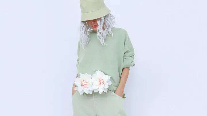
TL;DR: Pastels are tints — hues lightened with white — and they only fail when an outfit has no dark anchor. Match the color's temperature to your undertone, add one deep piece for contrast, choose fabrics with body, and protect pale garments from deodorant stains and dye transfer.
The soft color scheme has stopped behaving like a seasonal novelty. Blush, lilac, cloud blue, mint, and butter yellow now appear in tailoring, outerwear, and streetwear year-round, at every price point. That's good news and a small trap: pastels are unforgiving of bad fabric and flat styling in a way that black never is. This guide covers what pastels actually are, which ones will suit you, and how to keep them looking deliberate rather than faded.
What exactly is a pastel, and why does it look "soft"?
A pastel is a hue mixed with white, producing a color with high lightness and low saturation — in color terms, a tint rather than a shade. Baby blue and navy are the same hue; one has white added, the other black.
That matters practically because pastels sit in the top quarter of the value scale, close to white and close to each other. Two pastels placed side by side create almost no contrast, which is why head-to-toe soft color can read as vague or unfinished. The softness is a feature of the palette, not of the outfit — the outfit still needs structure from somewhere.
Designers lean on pastels when the shape is doing the work: a sharply cut suit, an oversized coat, a pleated skirt with real movement. Soft color plus soft silhouette plus soft fabric is three votes for the same thing, and it usually looks like pajamas.
Which pastel shades are people actually wearing now?
The tones with the most reach right now are cloud blue, lilac, creamy peach, sage-leaning mint, butter yellow, and a dusty blush that behaves almost like a neutral. Each has a distinct temperature, which is what determines who it flatters.
| Shade | Temperature | Best neutral partner | Fabric that suits it |
|---|---|---|---|
| Lilac / lavender | Cool | Charcoal, silver, indigo | Wool suiting, satin, fine knit |
| Cloud blue | Cool | Navy, white, gray | Poplin, denim, cashmere |
| Mint / sage | Cool to neutral | Black, taupe, cream | Linen, cotton twill, knitwear |
| Blush / dusty rose | Neutral | Chocolate, camel, black | Wool coating, silk, suede |
| Peach / apricot | Warm | Cream, tan, olive | Crepe, jersey, light corduroy |
| Butter yellow | Warm | Ecru, brown, denim | Cotton, raffia, chunky knit |
How do I wear pastels without looking washed out?
Put one element from the bottom third of the value scale into the outfit — a dark shoe, a leather belt, indigo jeans, sunglasses, or a deep bag. The goal is simple: your face should not be the darkest thing you're wearing.
That single rule solves most pastel failures. A lavender suit reads powerful with black loafers and flat with white sneakers. A mint blazer over a graphic tee works because the print supplies contrast the color can't.
The second technique is tonal stacking. Three depths of the same hue — pale blush, mid rose, deep berry — create the impression of dimension without introducing a competing color. This is the approach that makes soft palettes look considered rather than accidental, and it's the same logic behind a quiet luxury wardrobe built on restrained color.
The contrast test that takes four seconds
Photograph the outfit and convert the image to black and white on your phone. If the picture turns into one undifferentiated gray blob, you need an anchor. If you can clearly see where the jacket ends and the trousers begin, you're fine.
Which pastels suit my skin undertone?
Cool undertones — skin that reads pink, rosy, or blue-veined — generally look best in lilac, cloud blue, icy mint, and cool blush. Warm undertones, which read golden or peachy, are lifted by butter yellow, apricot, sage, and cream. Neutral undertones can wear most of the range.
Test it in daylight, not store lighting. Hold the garment under your chin and look for shadows: if the color drops a gray cast under your eyes or makes your skin look tired, it's fighting your undertone.
The rescue rule: a pastel that doesn't flatter your face is still perfectly wearable below the waist. Mint trousers with a cream sweater sidestep the problem entirely. Reserve the flattering pastels for shirts, scarves, and knitwear.
What fabrics make pastels look expensive instead of cheap?
Pale, low-saturation dyes hide nothing. Uneven yarn, thin weaves, visible seam allowances, and cheap interfacing all show through a pastel fabric in a way they never would in black. Fabric choice, not brand, is what separates a pastel that looks luxurious from one that looks like a costume.
- Structure: wool suiting, cotton twill, crepe, and heavier knits hold shape and cast real shadows at the seams.
- Surface: satin, silk, suede, raffia, and bouclé give the eye something to read when the color is quiet.
- Edge: a dark leather or vegan-leather piece stops an all-pastel look from tipping saccharine.
- Avoid: thin polyester jersey and unlined pale poplin — both go translucent and pick up every wrinkle.
The opacity test most people skip
In the fitting room, crouch down in front of the mirror and take one photo with flash. Both reveal see-through fabric that ordinary standing light conceals. Check whether pocket bags and seam allowances cast shadows through the front of the fabric; if they do, no amount of styling fixes it. This is the single most common and most expensive mistake in pale trousers and skirts.
How much do pastel pieces cost, and where do they turn up?
Pastels appear across every tier, but what you're paying for changes. At the budget end you're buying the color; at the top you're buying fabric weight, lining, and dye consistency — which, with pale shades, is most of the value.
| Tier | Typical examples | What you get | Watch for |
|---|---|---|---|
| Budget | Zara, H&M, Uniqlo | Current shades, low risk on trend pieces | Thin fabric, no lining, uneven dye |
| Mid-range | COS, & Other Stories, Aritzia | Better weight, cleaner finishing | Fabric blends that pill at friction points |
| High end | Jacquemus, Acne Studios, Tibi | Fabric quality, cut, color depth | Dry-clean-only pale garments get costly |
Our editorial rule: spend on the pale piece worn closest to the body or the one that must hang correctly — a coat, tailored trousers, a knit. Spend less on the accent: a peach bag, a mint tee, a lilac scarf. And if you buy a matching pastel set, buy both halves at once; pale dye lots vary between production runs, and two mints bought a month apart often don't match.
Can pastels work in fall and winter?
Yes — the season is carried by fabric weight and texture, not by hue. A dusty rose wool coat, a cream aran knit, or pale olive flannel trousers read unmistakably as cold-weather clothing.
- Winter: icy blue scarves, ivory shearling, blush wool coating over charcoal.
- Autumn: burnt peach knitwear, pale olive trousers, corduroy in butter yellow.
- Spring: the classic territory — light layering, poplin, tonal dressing.
- Summer: mint linen sets and lilac cotton, anchored by a tan or black sandal.
The failure mode is wearing a summer-weight pastel in January. A pale poplin shirt in winter looks displaced; the same color in brushed flannel does not.
What does a small pastel wardrobe look like in practice?
Here is a worked example using five pieces: a blush wool coat, lilac wide-leg trousers, a cream fine-gauge knit, a white cotton shirt, and dark indigo jeans, plus black loafers and a chocolate leather bag.
- Workday: lilac trousers, cream knit, black loafers, chocolate bag. The two dark accessories supply all the contrast needed.
- Weekend: indigo jeans, white shirt, blush coat. The coat is the only pastel — this is how to test the palette without committing.
- Evening: lilac trousers, blush coat, cream knit. Tonal stacking in three depths, finished with a dark shoe.
Five items, three genuinely different outfits, no orphan pieces. That ratio is the whole argument for building a capsule wardrobe around a limited palette rather than buying pastels item by item. Note that indigo denim is doing structural work in two of the three looks — it's the most useful dark anchor most people already own, and worth choosing carefully alongside the denim silhouettes actually worth buying.
How do I keep pale clothes from yellowing, staining, or picking up color?
Three things damage pastels, and all three are preventable. Aluminum compounds in antiperspirant react with sweat and body oils to create underarm yellowing, and dryer heat sets that stain permanently. Treat the area before washing and air-dry anything already marked.
Second, never store a pale garment unwashed. Invisible body oils oxidize over months in a closet and surface as yellow patches by next season — this is how a favorite cream sweater dies.
Third, watch for crocking: dye transfer from new dark denim onto pale bags, coats, and car seats. Raw indigo will mark a blush coat hem and a cream shoulder bag within a single wear. Wash new dark jeans separately a few times before pairing them with anything light, and keep pale leather away from unwashed indigo entirely.
Also skip chlorine bleach on pastels. It strips dye unevenly and can yellow protein fibers like wool and silk rather than whitening them. An oxygen-based product is the safer choice.
When should I skip pastels altogether?
Honestly: if your job involves grease, ink, clay, printer toner, or small children, pale clothing is a losing maintenance battle and no styling advice changes that. Buy the pastel accessory instead of the pastel trousers.
Low-contrast outfits also carry less visual authority, which matters in negotiation-heavy or highly conservative professional settings. That's not a reason to avoid the palette — it's a reason to anchor it with sharp tailoring in a deep neutral when the room is high stakes.
And if a specific shade genuinely doesn't suit you, it doesn't suit you. Trend coverage tends to imply every color is universal. It isn't, and the fastest way to enjoy the soft color scheme is to wear the two or three shades that flatter you and ignore the rest.
Key takeaways
- Pastels are tints — high lightness, low saturation — so they need one dark anchor in the outfit to stop reading as flat.
- Match the color's temperature to your undertone; move unflattering shades below the waist rather than abandoning them.
- Fabric matters more with pale colors than dark ones — test opacity by crouching in daylight and photographing with flash.
- Pastels are year-round when carried by weight and texture: wool, flannel, and chunky knits make soft color read as winter.
- Protect pale garments from deodorant residue, long-term storage without washing, and dye transfer from new dark denim.
- Buy matching pastel sets in one purchase — dye lots drift between production runs.
Frequently asked questions
What makes a color a pastel?
A pastel is a hue with white added, which raises its lightness and lowers its saturation — technically a tint sitting in the top quarter of the value scale with low to moderate chroma. Baby blue is a tint of blue; navy is a shade of the same hue. That high-lightness, low-saturation combination is what makes pastels read as calm rather than loud.
How do I wear pastels without looking washed out?
Add one element from the bottom third of the value scale — a dark shoe, belt, bag, jacket, or indigo denim — so your face isn't the darkest thing in the outfit. Washing out is a contrast problem, not a color problem. If you need pastels head to toe, stack two or three tones of the same hue so the eye reads depth, and finish with a defined shoe or sunglasses.
Which pastels suit cool versus warm undertones?
Cool undertones generally look best in lilac, cloud blue, icy mint, and cool blush; warm undertones suit butter yellow, apricot, peach, sage, and cream. If skin looks gray or shadowed under a color in daylight, it's the wrong temperature — move that shade below the waist and put a friendlier tone near your face.
Can you wear pastels in fall and winter?
Yes — the season is carried by texture and weight, not by hue. A dusty rose wool coat, a cream cable knit, or pale olive flannel trousers read as cold-weather clothing because the fabric has body and surface interest. What fails in winter is a summer-weight pastel fabric like poplin or linen worn alone.
Why do my pale clothes turn yellow under the arms?
Aluminum compounds in antiperspirant react with sweat and body oils, and tumble-dryer heat sets the resulting stain permanently. Treat the area before washing, skip the dryer on anything already marked, and never store a pale garment unwashed — invisible body oils oxidize into yellow patches over months in a closet.
Are pastels a bad idea for professional settings?
Not inherently, but low-contrast outfits carry less visual authority, so in high-stakes rooms anchor pastels with a sharply tailored dark piece. Pastels are also a poor match for jobs involving grease, ink, clay, or young children, and for anyone whose laundry routine is genuinely once-every-three-weeks.
How can I tell if pale trousers are see-through before buying?
Crouch in front of a mirror in daylight and photograph yourself with flash — both reveal opacity failures that a fitting-room mirror hides. Also check whether pocket bags, seam allowances, and interfacing cast visible shadows through the face of the fabric; if they do, the garment will look unfinished no matter how well it fits.